


brand + Packaging DESIGN
Blue Roo High Seltzer
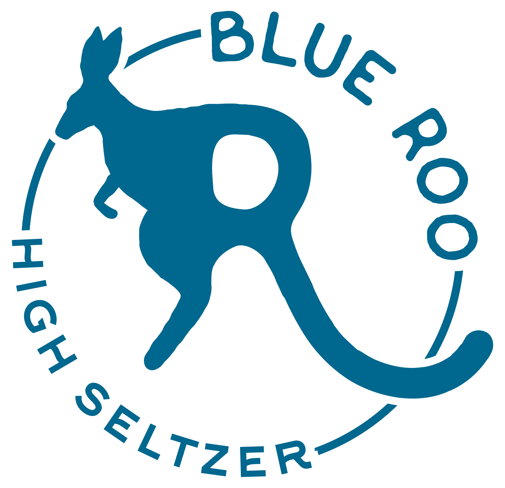
Blue Roo is a zero-calorie, hemp-derived THC seltzer made as an alternative to a drink with alcohol in it. Silver Moon built the brand from the name up, a kangaroo whose tail becomes the R, then carried it across a three-flavor line of 12 oz slim cans that feel like a night out, not a trip to the dispensary.

CLIENT
Blue Roo
INDUSTRY
THC Beverage
SERVICES
Brand Identity + Packaging
Deliverables
Logo Suite
Brand Board
3-Flavor Can Line
the challenge
Sell the buzz without the booze, and without the stoner clichés.
THC seltzers compete for the same moment as hard seltzer and craft beer: the cooler at a cookout, the fridge at a party. But the category's look tends to swing between two extremes, clinical wellness packaging or leaf-heavy cannabis imagery. Neither one invites a social drinker who's curious about cutting back to pick up a can.
Blue Roo needed a brand that felt easygoing and familiar enough to sit next to a six-pack. It also had to carry a heavy load of required information, dosage, age limits, warnings, and hemp compliance language, without that information taking over the can.
The Approach
Laid-back, a little playful, and built around one kangaroo.
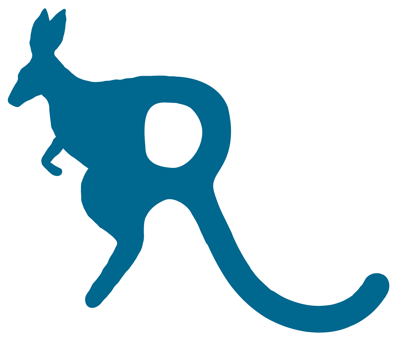
The name gave the brand its mascot, and the mascot became the logo. A leaping kangaroo's tail sweeps down to form the R in "ROO," set in hand-drawn letters that feel friendly and a little retro. One deep Roo Blue carries the brand everywhere, and a soft cream and a repeating arch pattern keep it warm instead of cold or clinical.
The voice followed the same easy tone. "Sip. Chill. Repeat." sets the mood, and the back-panel copy explains the experience the way a friend would: an uplifting vibe, felt within about 15 minutes, so wait before reaching for another.

the brand system
One blue brand, with a color for every flavor.
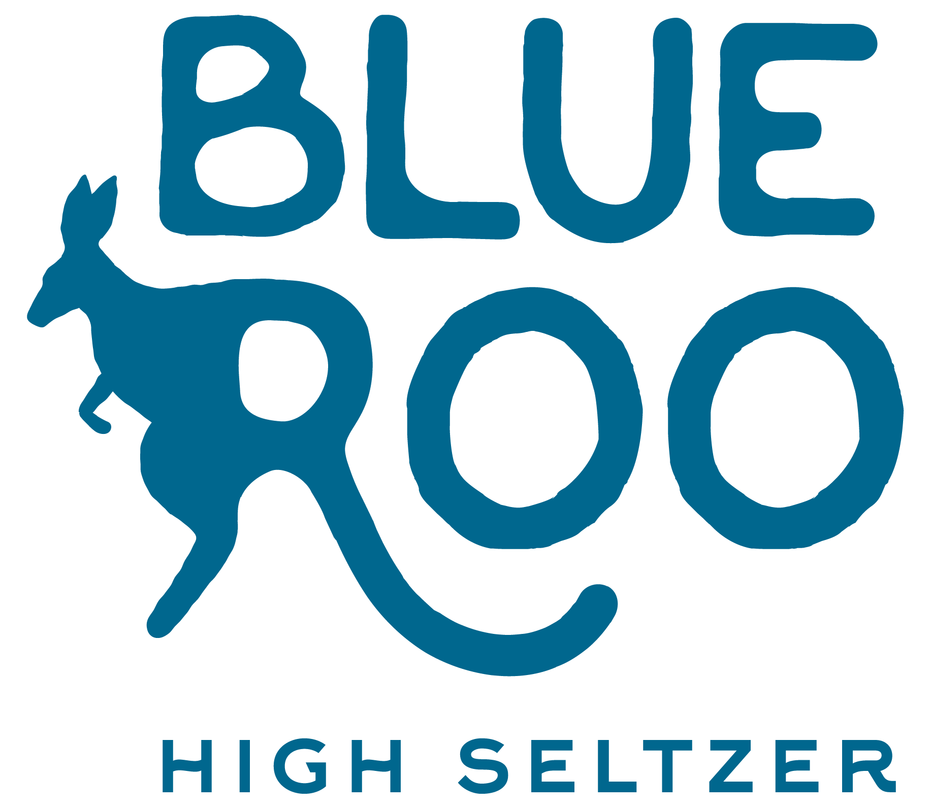
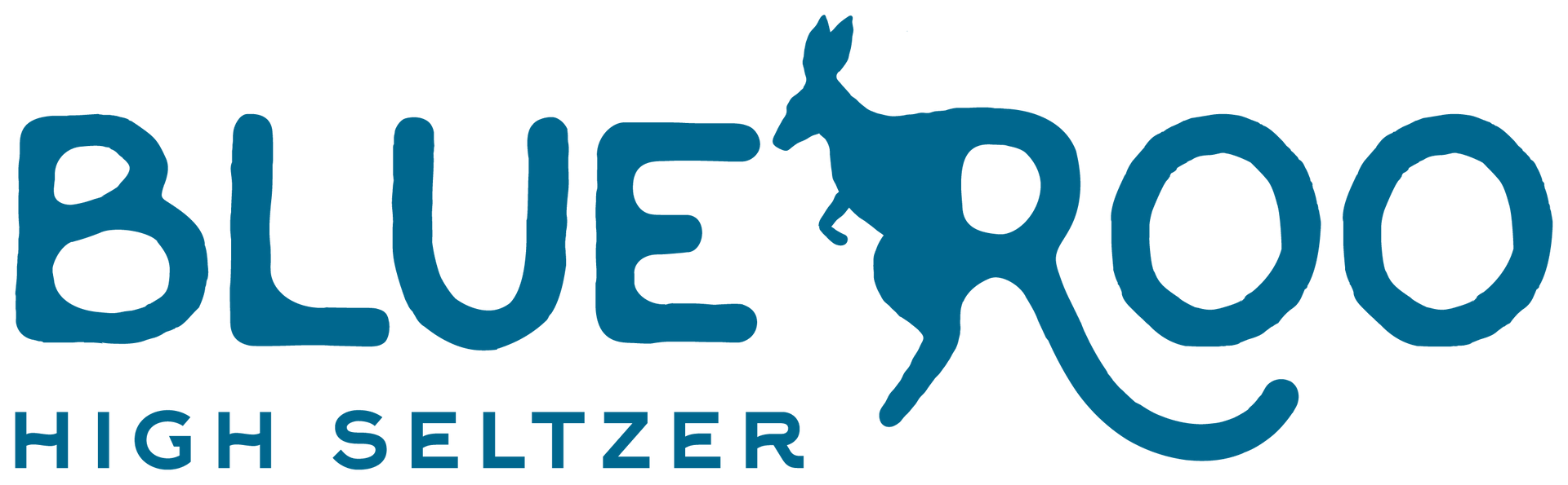
A stacked primary logo for the can, a horizontal version for wide spaces like case packs and web headers, a circular badge for stickers, coasters, and merch, and a standalone kangaroo-R icon for social avatars and small spaces.
BRAND COLORS
Roo Blue
PANTONE 7706 C
#00678D
CMYK 100 · 27 · 0 · 45
Cream
#F4E7DE
RGB 244 · 231 · 222
CMYK 0 · 5 · 9 · 4
Flavor Colors
Mango Orange
PANTONE 7625 C
#F15B4D
CMYK 0 · 62 · 68 · 5
Mango Peach
PANTONE 712 C
#FDCB9A
CMYK 0 · 20 · 39 · 1
Watermelon Green
PANTONE 2274 C
#D1DAB0
CMYK 4 · 0 · 19 · 15
Watermelon Pink
PANTONE 2346 C
#F15D61
CMYK 0 · 61 · 60 · 5
The Packaging
One can, three flavors, zero guesswork.
Every can shares the same cream body and Roo Blue logo, so the line reads as one brand from across the store. Flavor lives in just three places, the rim band, the dosage icons, and the flavor panel, which makes the lineup easy to shop and easy to grow.
01. Dosage you can read at a glance
The back holds the Nutrition Facts, 21+ and THC warnings, the hemp compliance statement, and a QR code to the lab results (COA), all set in Roo Blue so the required details look like part of the design.
02. A flavor panel built to swap
A framed panel holds the effect ("Uplifting Vibe"), the flavor name, and the can size. New flavors or effects only change the panel and its colors, so the line can grow without a redesign.
03. Compliance that still looks on-brand
The back holds the Nutrition Facts, 21+ and THC warnings, the hemp compliance statement, and a QR code to the lab results (COA), all set in Roo Blue so the required details look like part of the design.

