
brand + Packaging DESIGN
Kinro
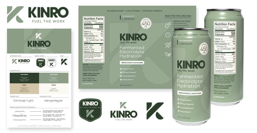
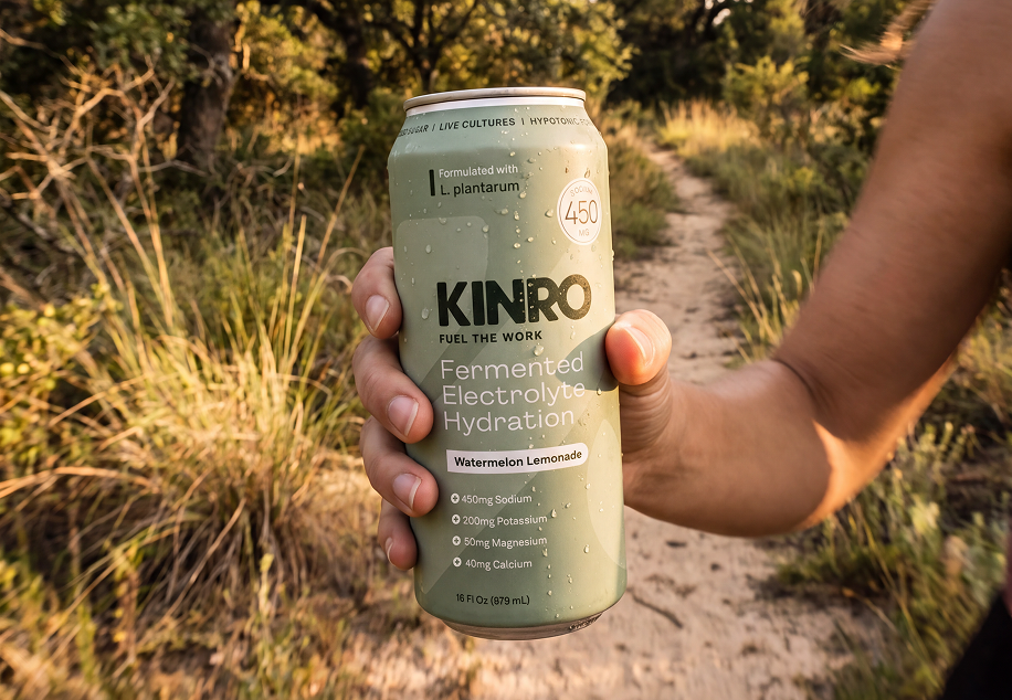
Kinro is a fermented electrolyte drink brewed in Bellville, Texas, made for people who sweat for a living and for the long run. Silver Moon built the brand from the name up, then carried it onto a 16 oz can that explains a brand-new kind of hydration in the time it takes to reach into the cooler.
CLIENT
Kinro
INDUSTRY
Functional Beverage
SERVICES
Branding Design
Packaging Design
Dielines
3D Renderings
Deliverables
Logo Suite
Can Design
the challenge
A new category, a crowded cooler, and no brand yet.
Kinro arrived with a formula and no identity. The product sits between two shelves: it's an electrolyte drink like the sports drinks, and it's fermented with live cultures like the kombucha a few doors down. Neither shelf's usual look fit it. Loud sports-drink branding would hide the gut-health story, and wellness pastels would lose the athletes and working people it's made for.
So the brand had to do two things at once. It needed to feel tough and dependable enough for a long shift or a long run, and the can needed to make "fermented electrolyte hydration" make sense to someone who'd never heard the phrase.
the approach
Workwear, not neon. Plain talk, not lab talk.
The identity takes its cues from gear built to last, not from the energy-drink aisle. A heavy, rounded wordmark and a two-piece K icon give the brand weight without shouting. A palette of forest green, sage, khaki, and cream reads natural and made-by-hand, which suits a fermented product, and it's still tough enough for a job site. "Fuel the Work" became the tagline and the tone for every line of copy after it.
On the can, the job was translation. Every claim a shopper might doubt, like "fermented," "hypotonic," and "L. plantarum," is paired with a plain-language reason it matters. The numbers they actually shop by (sodium first, then the rest of the electrolytes) are pulled out where they can't be missed.
the brand system
One mark, built to work at every size.
A primary stacked lockup, a horizontal alternate for tight spaces, two shield badges for merch, coolers, and event signage, and a standalone K icon that holds up at app-icon and bottle-cap size.

The Packaging
A can that answers questions before they're asked.
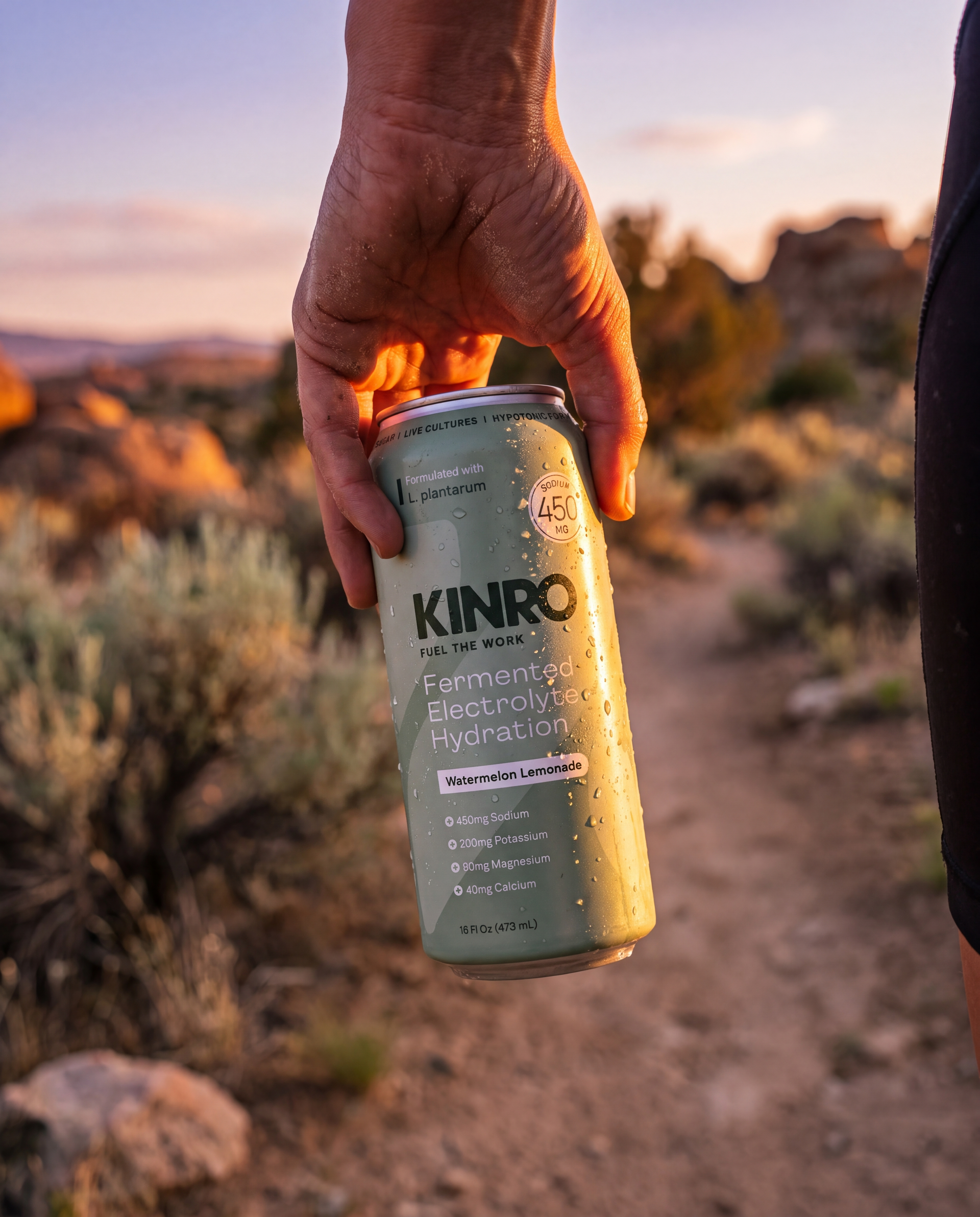
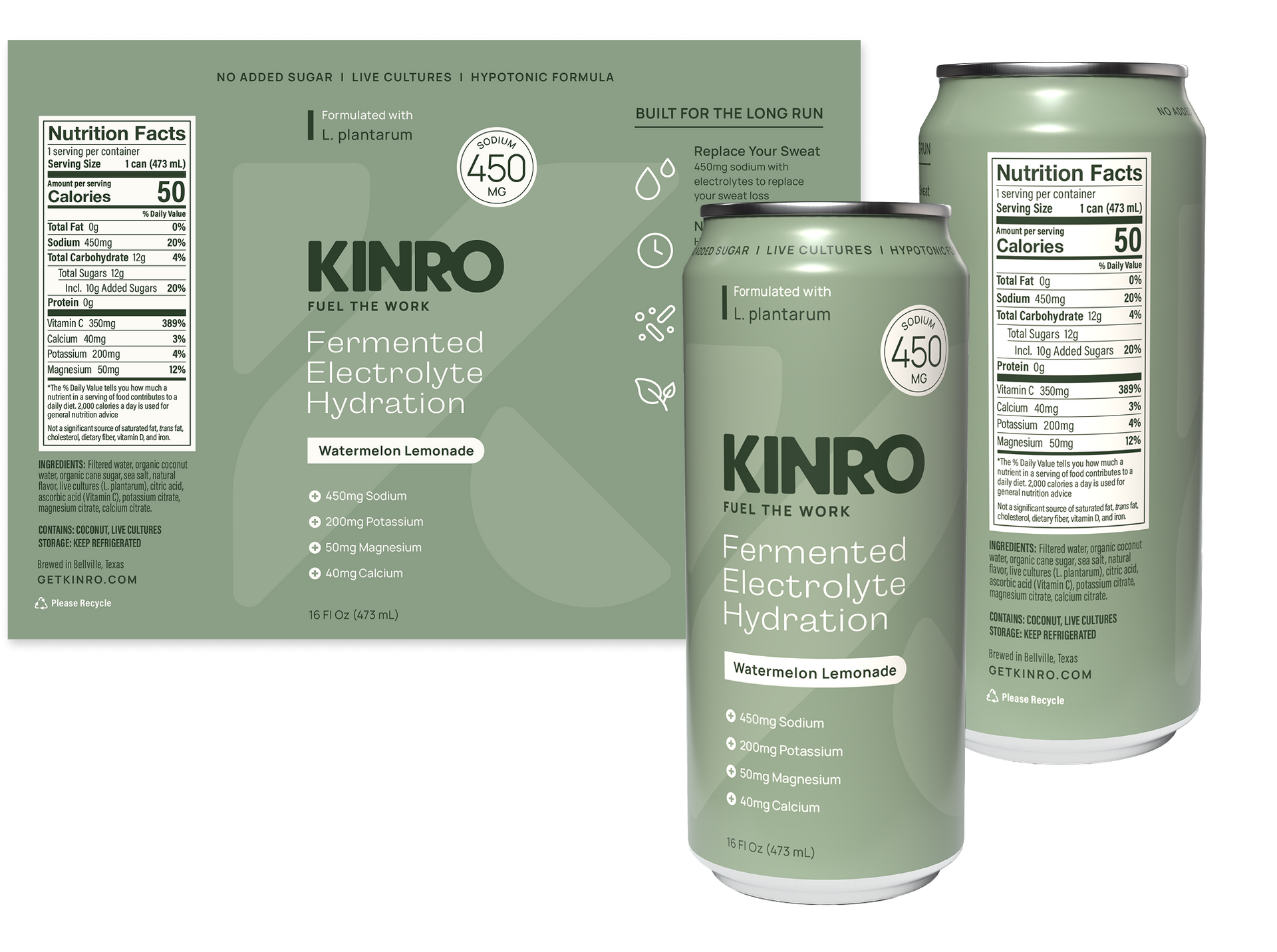
The sage can pulls straight from the brand palette and stands out quietly in a cooler full of saturated color. Dark green type carries the brand, cream carries the product story, and a subtle oversized K runs across the whole wrap to tie the three sides together.
01. front
Read it in three seconds
Brand, then category ("Fermented Electrolyte Hydration"), then flavor in a cream pill. A 450 mg sodium seal sits at eye level for the shopper comparing electrolyte counts, backed by a four-line mineral list.
02. SIDE
Why it's different
Brand, then category ("Fermented Electrolyte Hydration"), then flavor in a cream pill. A 450 mg sodium seal sits at eye level for the shopper comparing electrolyte counts, backed by a four-line mineral list.
03. back
On-brand compliance
The Nutrition Facts panel, ingredients, allergen and refrigeration notes, and barcode are all set in the brand's cream and dark green, so the required information looks like it belongs on the can.
what shipped
From wrapper to case, to production-ready art.
A complete brand, from first sketch to print-ready can:
- Primary logo, horizontal alternate, two badge logos, and standalone K icon
- "Fuel the Work" tagline lockups
- Color palette with Pantone, CMYK, RGB, and hex specs
- Typography system with marketing type rules for headlines, subheads, and body copy
- One-page brand identity board
- 16 oz can design for Watermelon Lemonade: front, benefits panel, and Nutrition Facts panel, with 3D renders
- Room to grow: new flavors swap only the flavor pill, so the line can expand without a redesign