

brand + MERCH DESIGN
Spicy Rigatoni Club
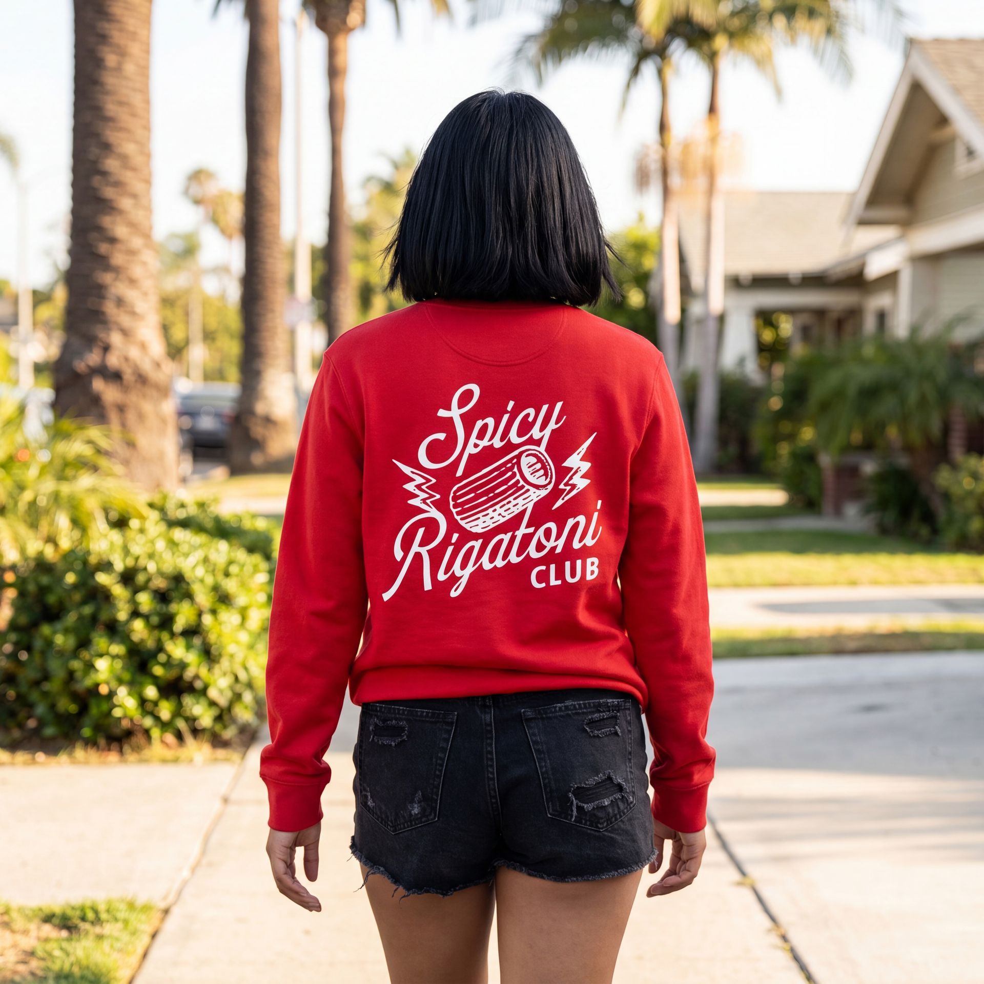
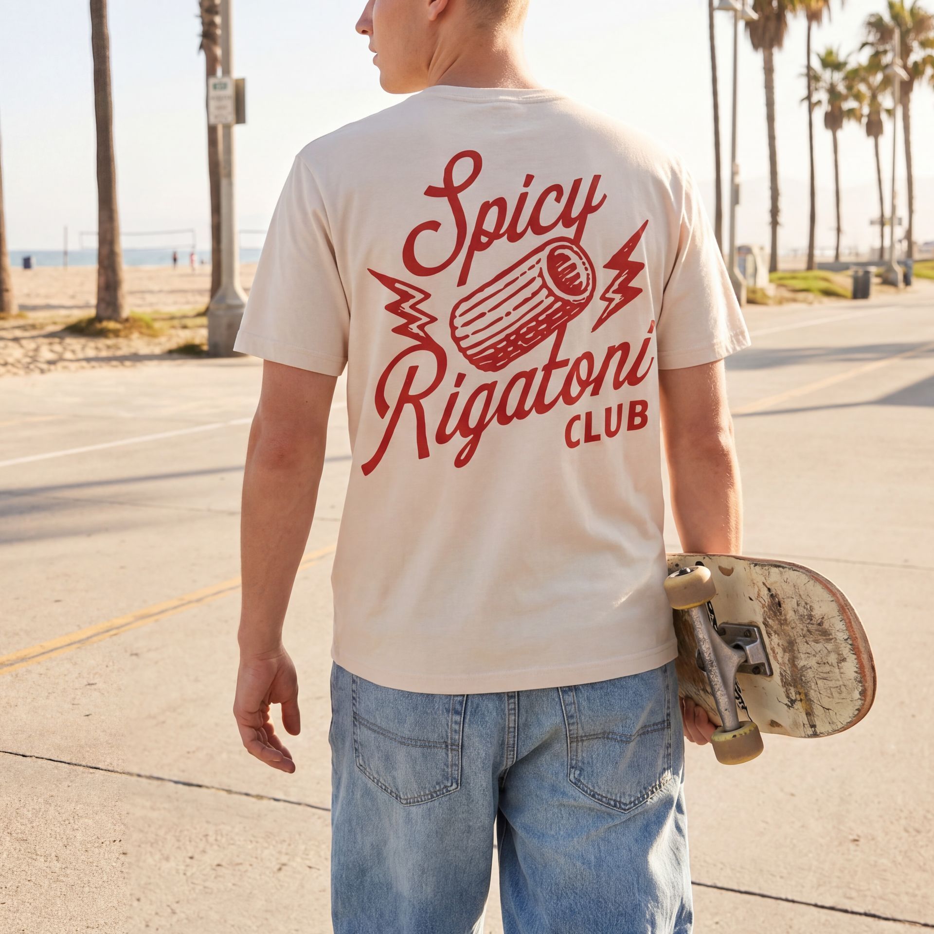
Spicy Rigatoni Club is a merch line built around one much-loved dish, shared by three Italian restaurants: Ospi, Jemma, and Jame Enoteca. Silver Moon designed the logo suite and brand board, then put the club on totes, tees, and hats that look good away from the dinner table.

CLIENT
Memento Mori Hospitality
INDUSTRY
Restaurant Loyalty Club
SERVICES
Brand Identity + Merch
Deliverables
Logo Suite
Brand Board
Merch Designs
the challenge
Turn a pasta dish into something people want to wear with pride.
A lot of restaurant merch is a logo on a shirt that gets worn once. This project started from a different place: the dish already had fans, so it deserved its own identity, one with enough personality that people would buy a tote or a hat because they like how it looks.
It also had to work in production. Merch is mostly one-color screen printing and embroidery, so every version of the logo needed to hold up in a single ink color and at small sizes, from a full tote print down to a hat front.
The Approach
A retro script, a little heat, and one hand-drawn noodle.
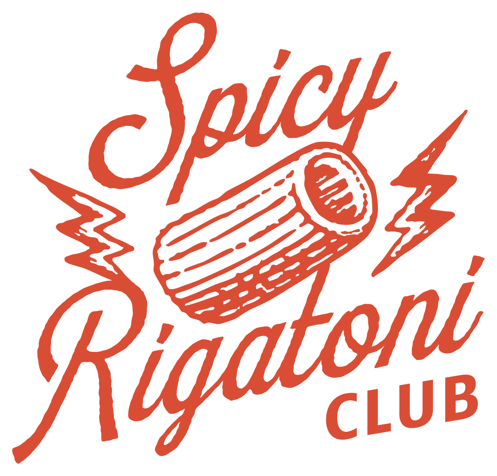
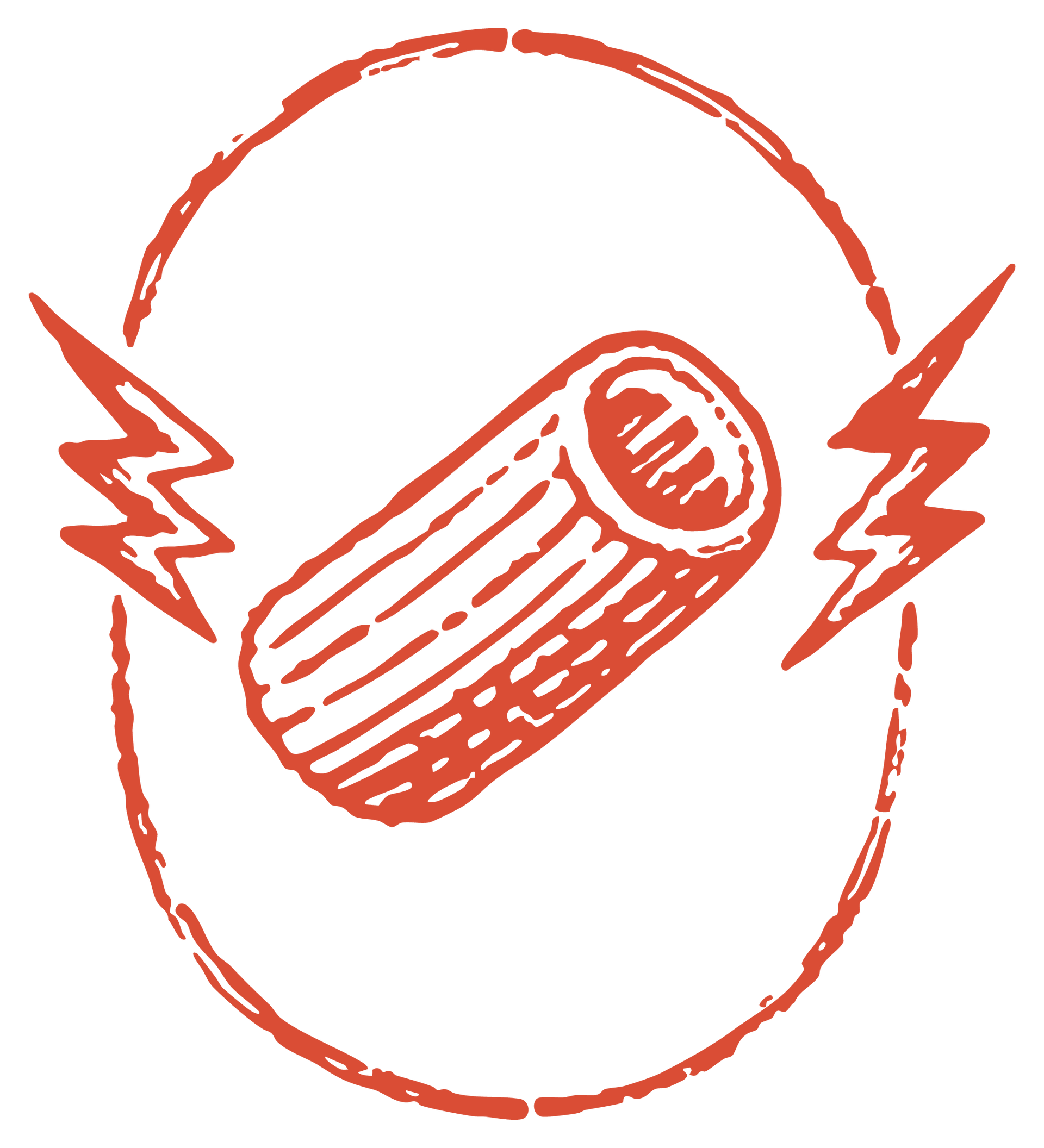
The primary logo pairs a loose, upright script with an illustrated rigatoni, with a lightning bolt on each side for the spice. The rough, printed texture gives it the feel of an old club patch or a vintage diner sign, so it reads as fun first and restaurant second.
The colors come straight from the plate. Vodka Sauce Orange leads, a dusty Blue gives the brand a second option for merch and hats, and the warm cream background is named Mezze Maniche, after the short cut of rigatoni.
the brand system
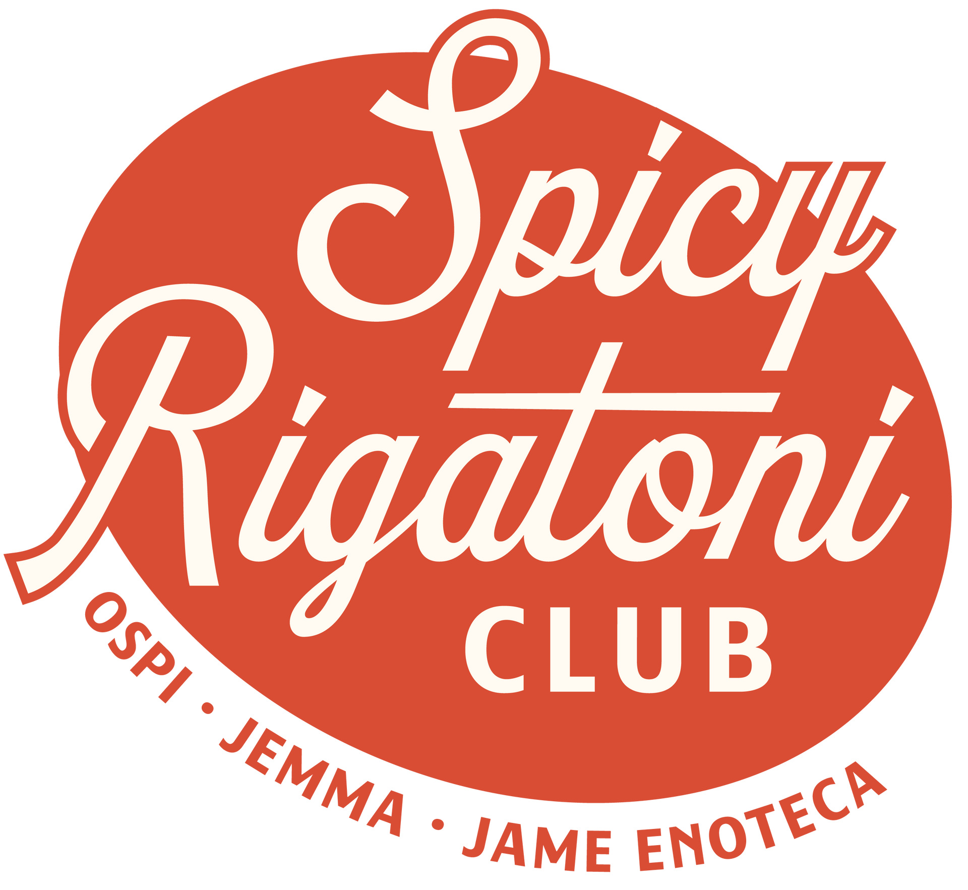
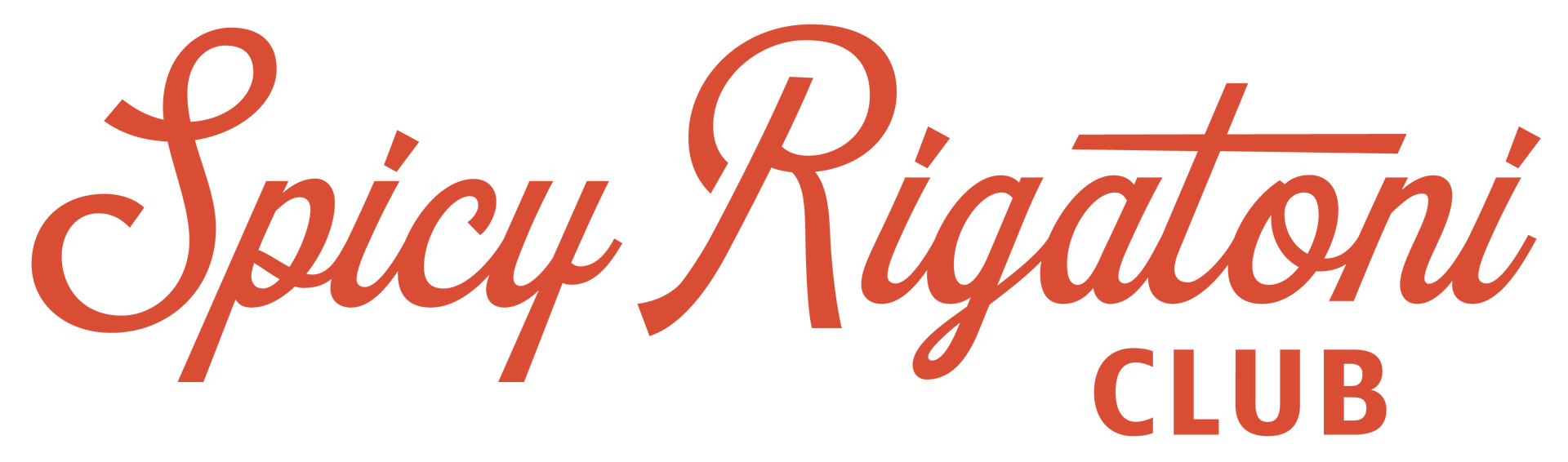
One logo, three supporting marks, three colors.
A badge for round spaces and the main merch print, a one-line wordmark for wide spaces like hat fronts and web headers, and a rigatoni icon for social avatars, stickers, and tags.
BRAND COLORS
Vodka Sauce Orange
PANTONE 7417 C · 3516 U
#D94D35
RGB 224 · 79 · 57
CMYK 12 · 85 · 89 · 0
Denim Blue
Pantone 2374 C · 2374 U
#4c5577
RGB 76 · 85 · 119
CMYK 36 · 29 · 0 · 53
Mezze Maniche
#FFF8EE
RGB 255 · 248 · 238
CMYK 0 · 3 · 7 · 0
The Merch
Totes, tees, and a hat for the regulars.
The badge does most of the work. It prints big on a tote or a cropped tee, shrinks down to a left-chest print, and swaps for the script wordmark where the space is wide and short, like the front of a hat.
01. Made for one ink color
The badge is a single solid shape with the lettering knocked out, so it prints in one color, keeps screen printing costs down, and works on any light blank.
02. The restaurants on every piece
Ospi, Jemma, and Jame Enoteca curve along the bottom of the badge, so every tote and tee points back to where you can order the dish.
03. A script that stitches clean
The one-line wordmark has simple, even strokes, so it embroiders well at hat size. Here it's in cream thread on a washed blue cap that matches the brand Blue.