

Packaging DESIGN
UnHinged
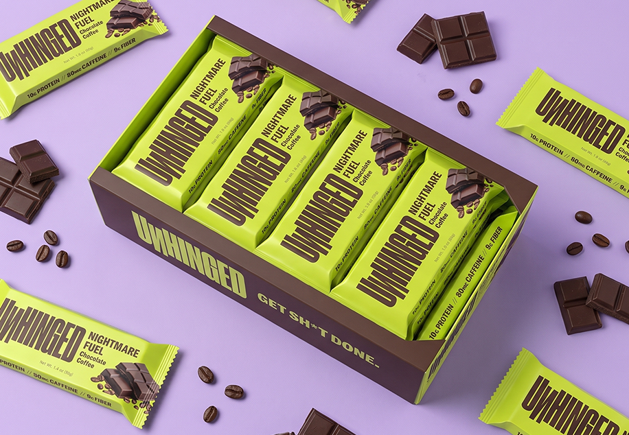
A protein bar brand for people who need to get sh*t done, built around an aggressive, metal-inspired identity and a packaging system loud enough to survive a gas-station shelf.
CLIENT
UnHinged
INDUSTRY
Protein Bars/CPG
SERVICES
Packaging Design
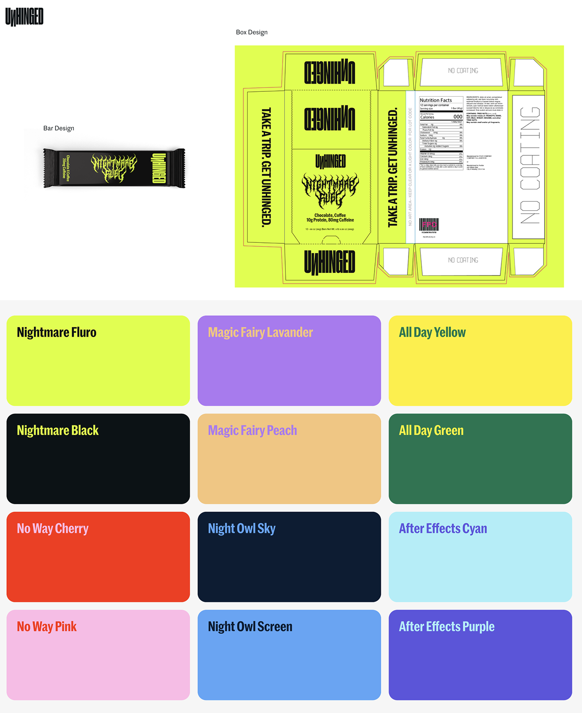
Dielines
3D Renderings
Deliverables
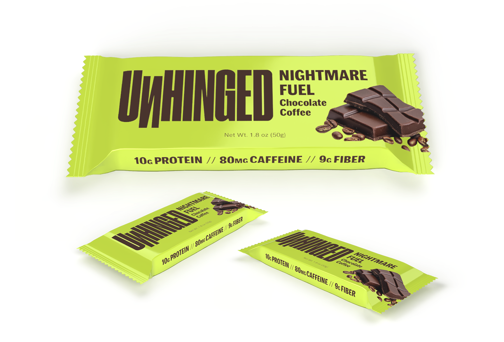
Wrapper
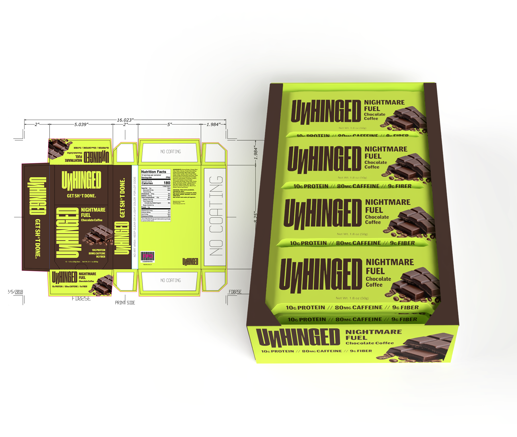
Case Box
the challenge
Protein bars all look the same. UnHinged couldn't.
UnHinged came to Silver Moon with its packaging already in progress. The bold, metal-inspired identity was working, but the wrapper wasn't doing enough to communicate what was in the bar. Real ingredients like coffee and cacao read as an afterthought, and the functional claims (protein, caffeine, fiber) were buried in small type instead of pulling their weight at shelf.
what the client provided
The client asked for something vibrant with an edge, without being too themed.
UnHinged came to Silver Moon with its packaging already in the works. The bold, metal-inspired identity was working, but the wrapper wasn't doing enough to communicate what was in the bar. Real ingredients like coffee and cacao read as an afterthought, and the functional claims (protein, caffeine, fiber) were buried in small type instead of pulling their weight at shelf.
The Approach
Bring the ingredients forward, sharpen every callout.
Working from the existing packaging, the redesign layered in visual callouts for the real ingredients inside each bar, coffee, cacao, and whey, so the product tells its own story before a shopper ever reads the fine print. Protein, caffeine, and fiber counts were pulled out of small type and rebuilt into a clean, scannable stat bar that reads from across the aisle.
The metal and skate-inspired wordmark, the acid-chartreuse and near-black palette, and the "Nightmare Fuel" flavor name all carried through untouched. This was a refinement of a system that was already working, not a rebuild of it.
The Approach
From wrapper to case, to production-ready art.
A packaging redesign built on top of UnHinged's existing identity, ready to go back to print:
- New ingredient visual system added to the wrapper (coffee, cacao, whey)
- Rebuilt callout hierarchy for protein, caffeine, and fiber counts
- Refreshed wrapper design, front and back
- Updated case box render and production dielines
- Room to scale: the system carries future flavors without a further redesign
Every render was built alongside a production-ready dieline: barcode, Nutrition Facts, and no-coating zones marked out for the printer, not just for show.