Brand + PACKAGING DESIGN
Canton Water Co.
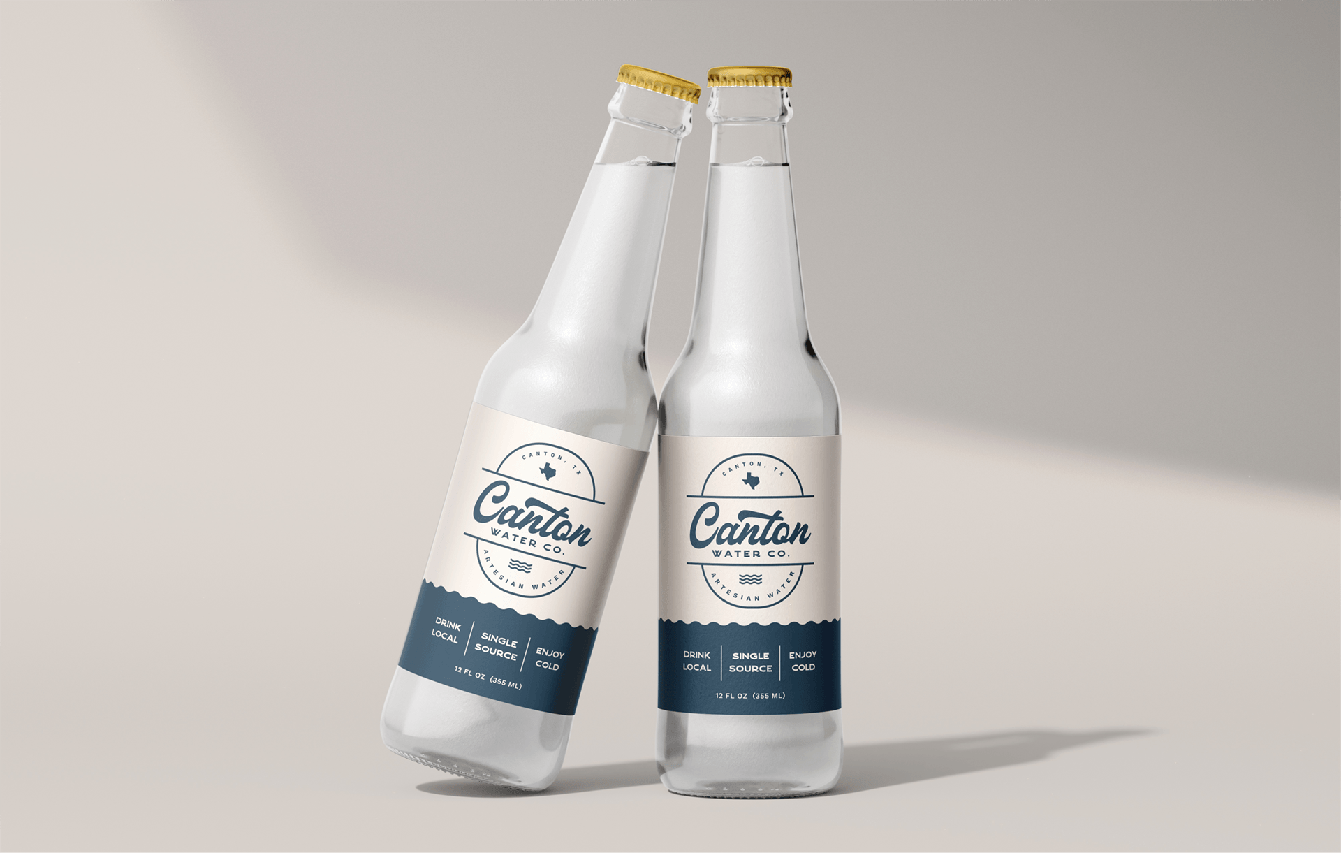
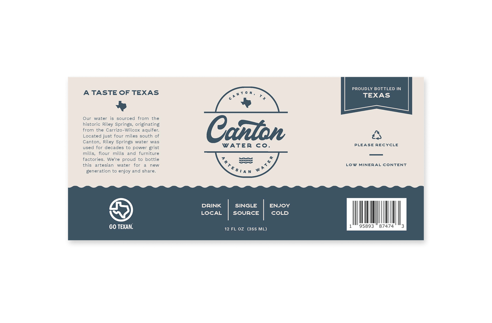
Marley enlisted my help in creating a new artesian water brand, sourced from a local spring. While they were unsure about the product's name, they had a clear vision for the branding: a rustic yet clean Texas aesthetic. My initial suggestion was to name the product after the region from which it originates to build local pride and support.
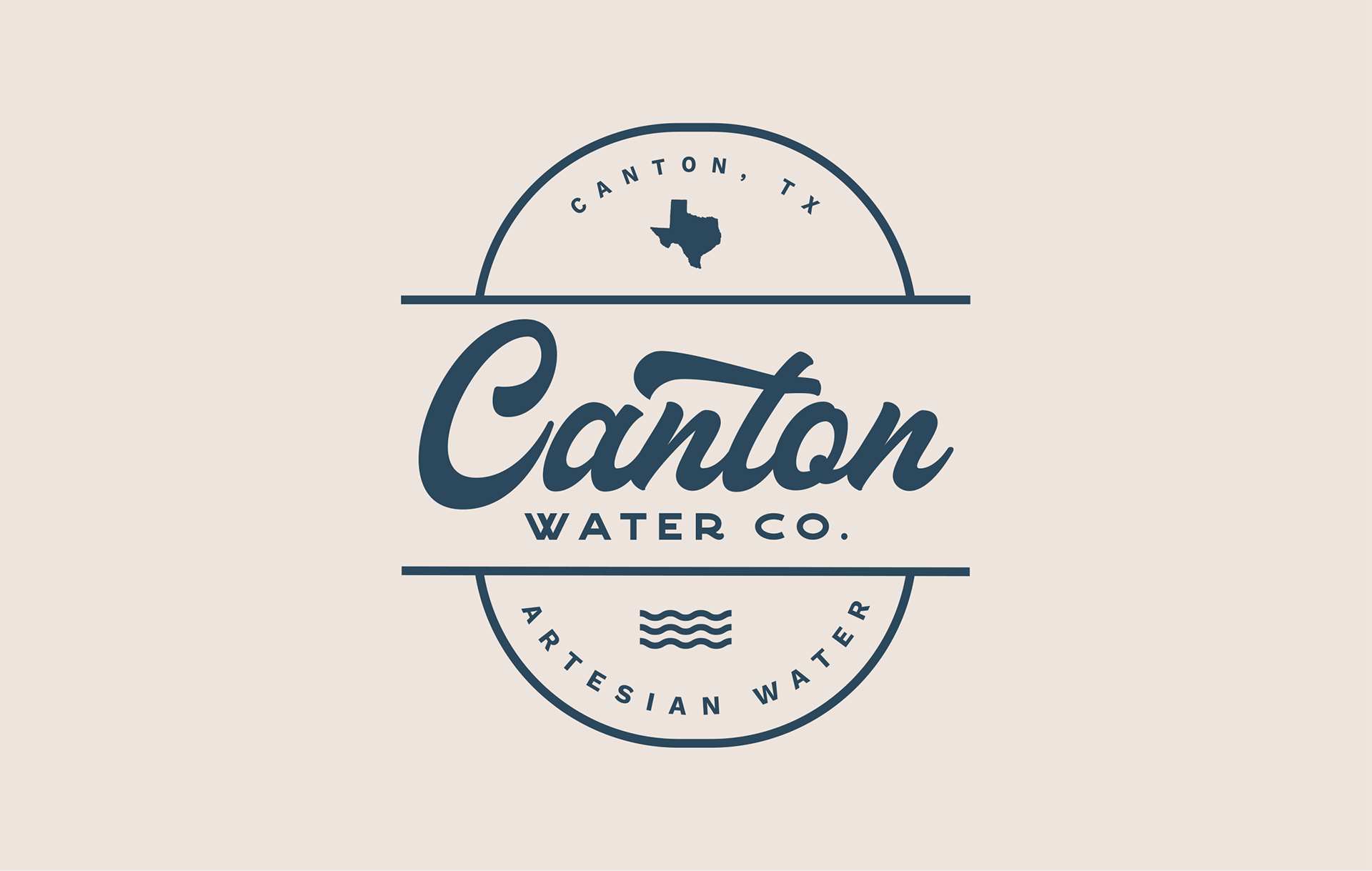
Thus, Canton Water Company (co. for short) was born, and my inspiration for the typography and design elements came from the iconic '50s and '60s signs I remembered from visiting Dallas as a child. The interweaving script fonts, surrounded by lights, had a classic western feel that I wanted to incorporate into the label.
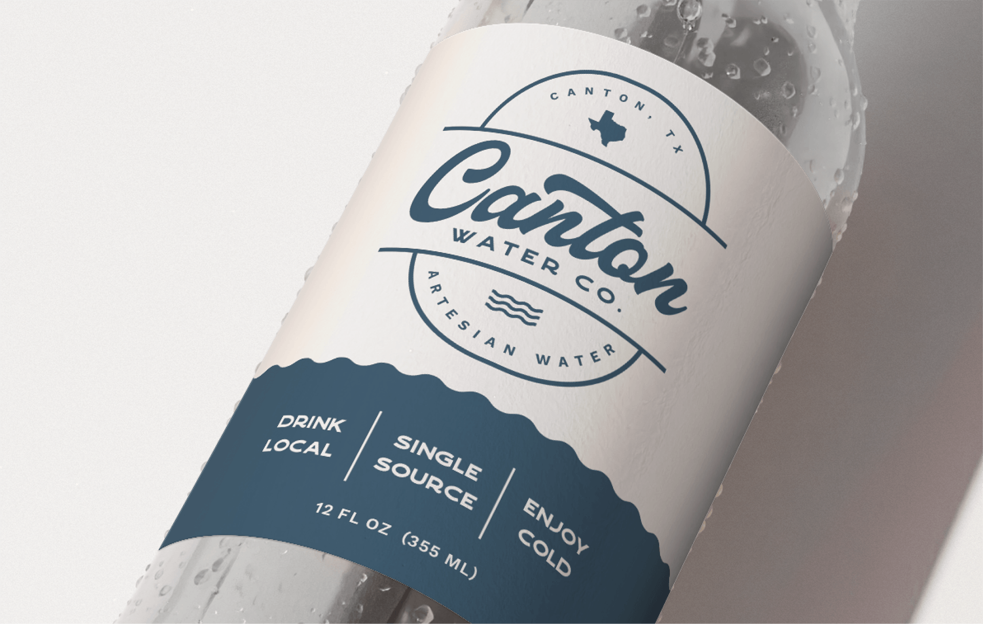
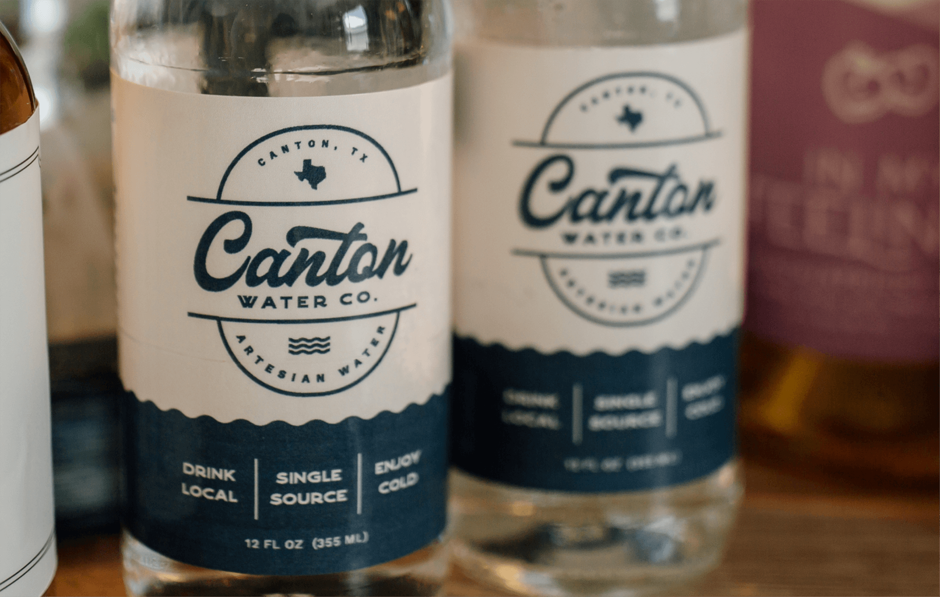
To reflect the water source, navy blue was an obvious color choice. Additionally, the hue pays homage to the cowboy culture's famous blue jeans. The wavy line on the label reinforces the product's origin from an artesian well. With its simple, clean, and monochromatic design, the label effectively captures the essence of the brand without the need for any grunge or additional imagery.
The final label design not only showcases the water source but also highlights Texas in multiple locations, a strategic choice to appeal to consumers who prioritize local products.
