


Brand + PACKAGING DESIGN
Northwest Territory Cider
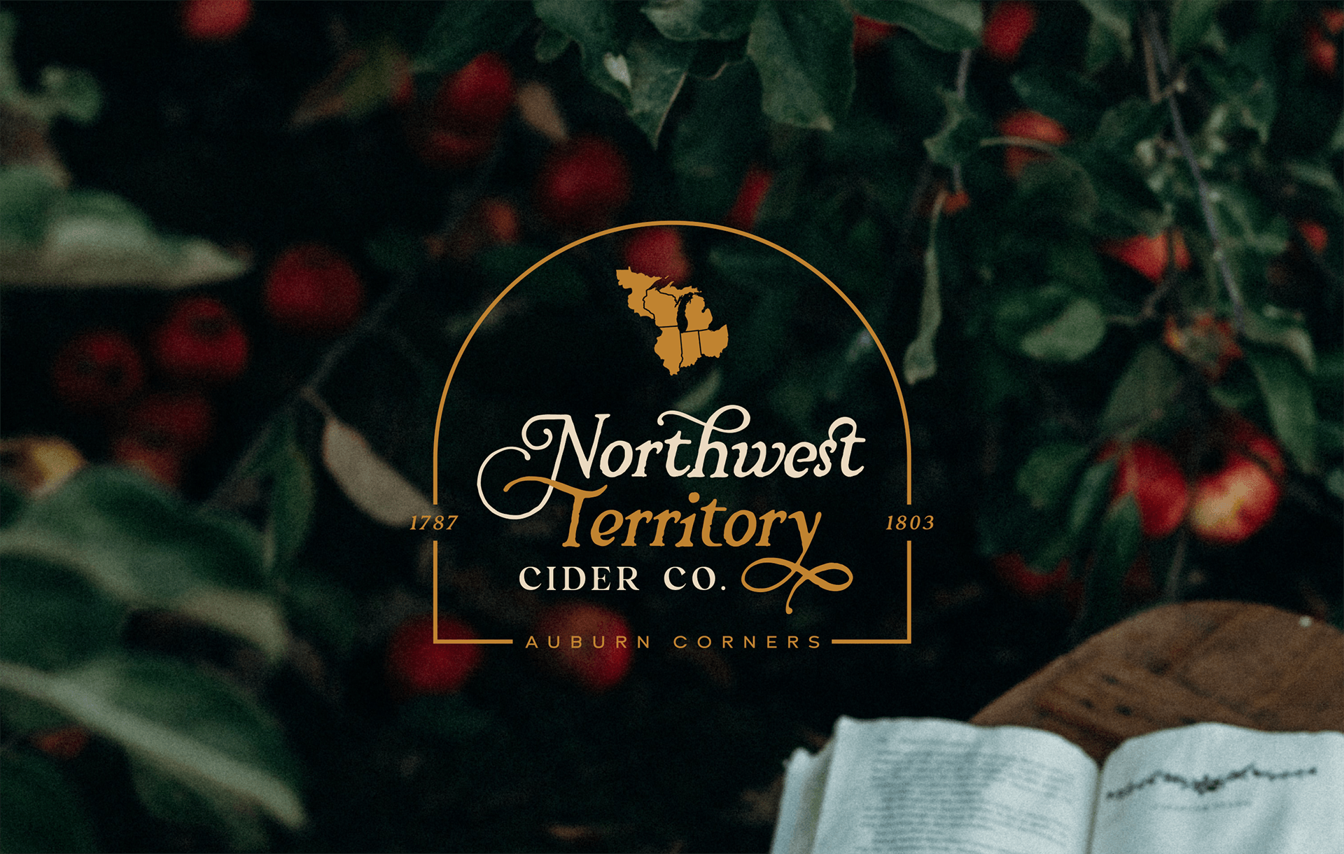
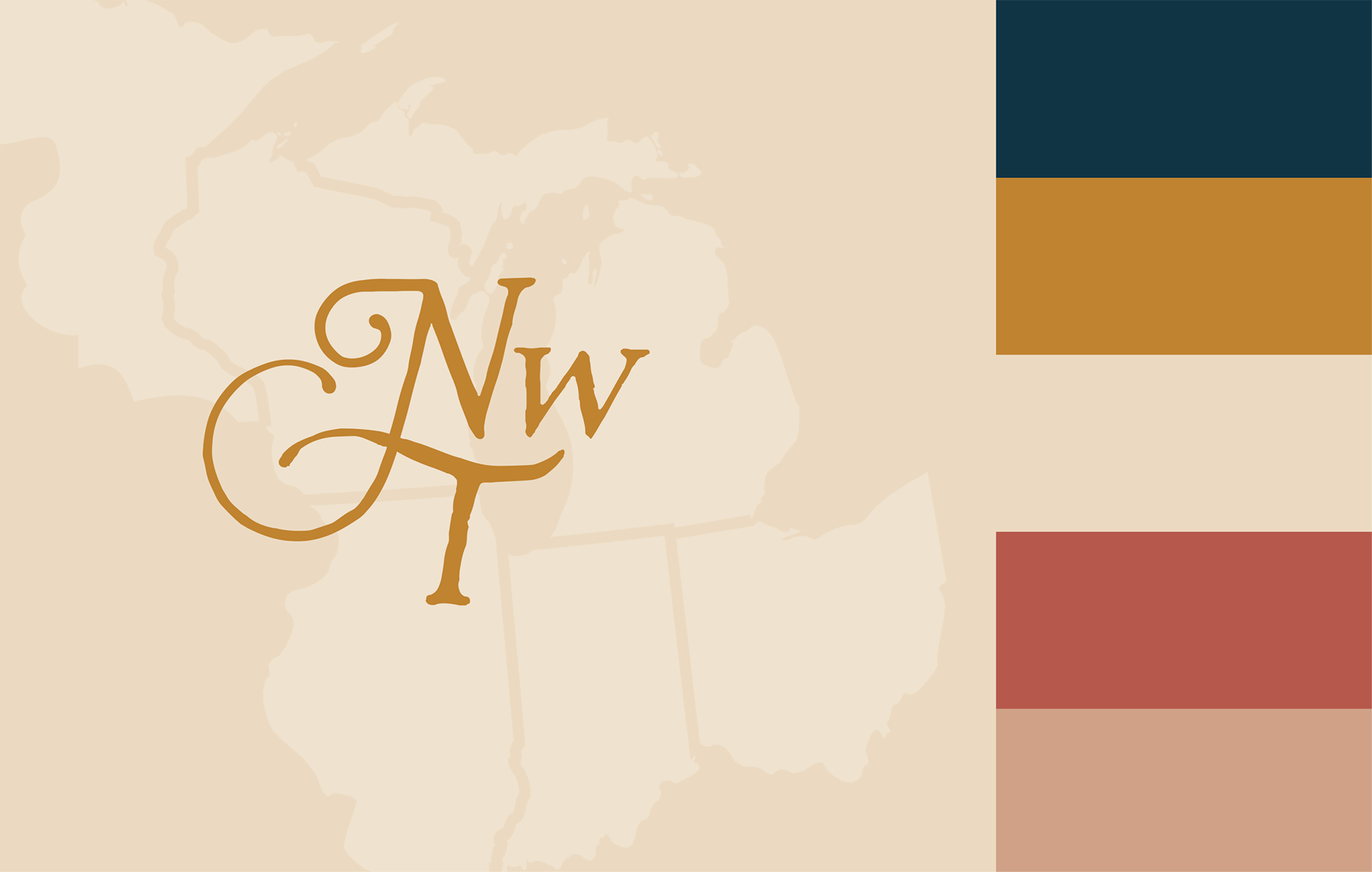
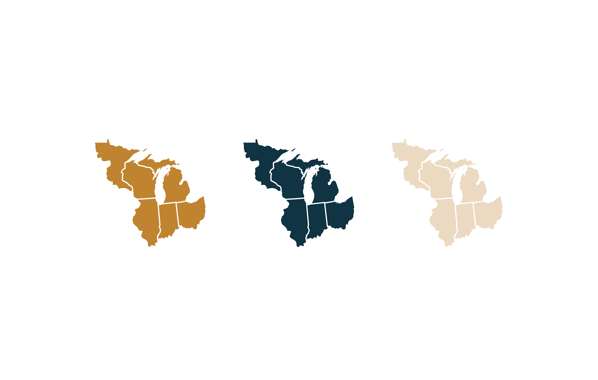
Northwest Territory Cider Co is a company that brings a fresh perspective to a historical era through their cider. The owners wanted to incorporate colonial elements into their branding without appearing too outdated. As the company is based in Ohio but the original Northwest Territory also included Michigan, Indiana, Illinois, Wisconsin, and parts of Minnesota, it was important to create an icon that represents the entire region.
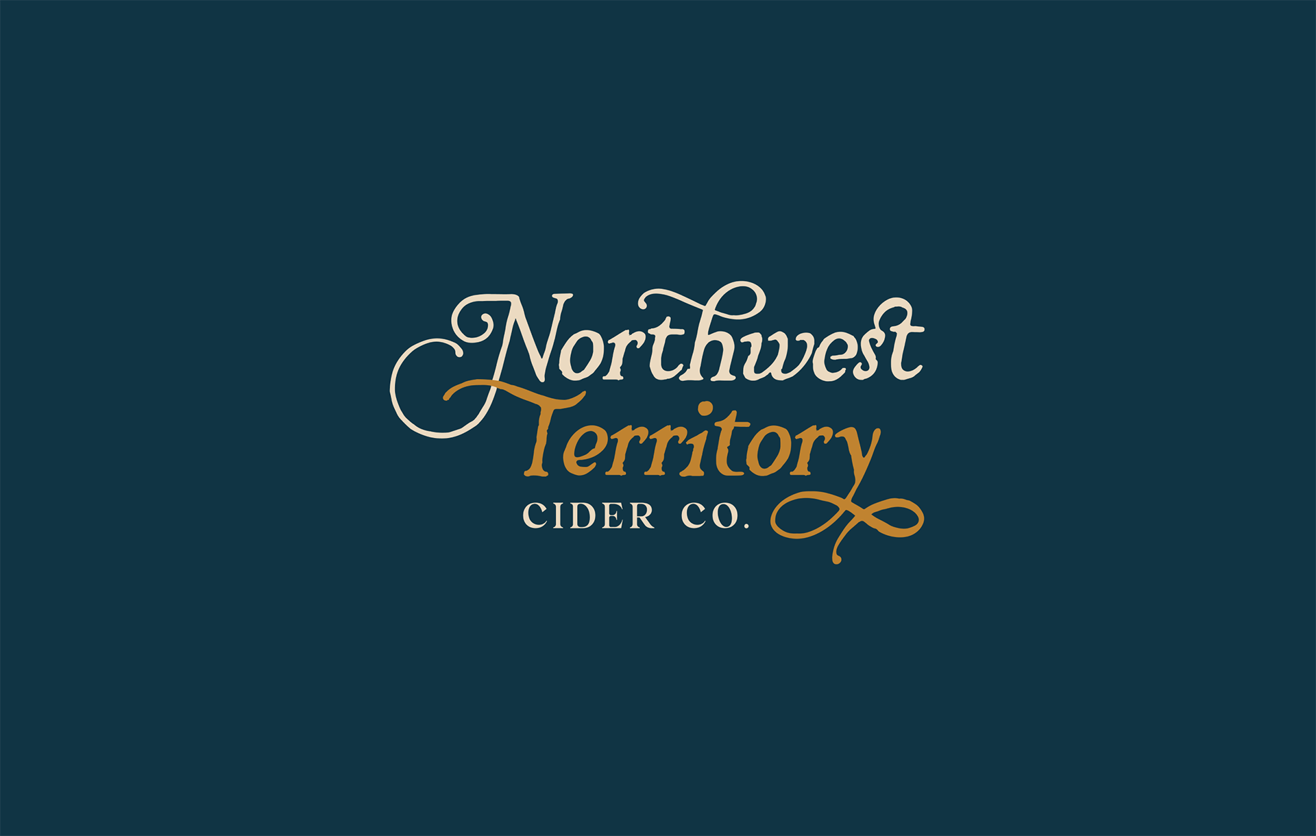
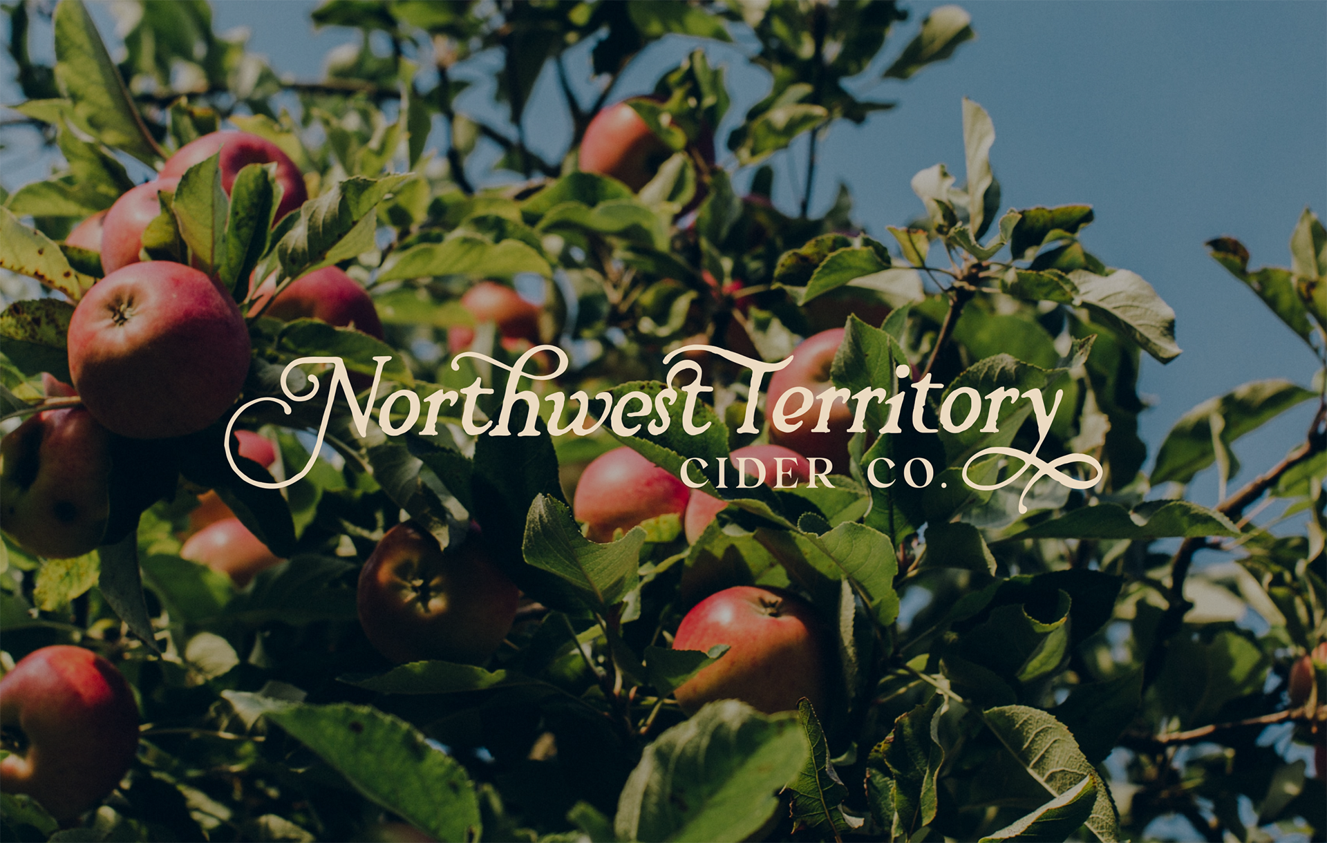
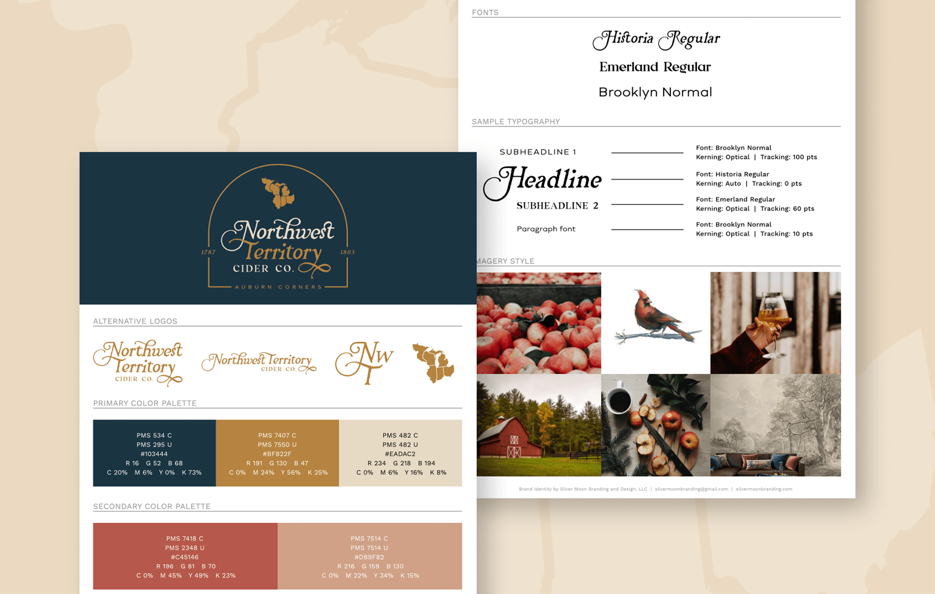
The branding features a rustic handwritten font encased in a sleek golden arch, which represents the perfect blend of old and new. The main font, Historia, is reminiscent of Jefferson's handwriting with elegant swooshes and slightly roughened edges. To contrast the aged handwriting with modern elements, supporting fonts Emerland and Brooklyn were used as modern serif and sans-serif, respectively.
The color palette features navy, gold, and tan as the primary hues, which represent the power of a new country, the eventual expansion westward, and aged paper that symbolizes the many letters sent during the early formation of the United States. Shades of red found in traditional red apples were used as secondary colors.
The combination of these design elements effectively delivers a neo-modern look that aligns with the company's emerging identity.